Want to create the ultimate user experience with your digital signage and communications technology? There are many ways to create the killer UX, depending on your situation, goals, people, and budget.
First, think about these features: touch, interactivity, visual data, and mobile content. Plan ahead and hit all four with engaging presentations, and you’re well on your way. Also think about how younger generations use their devices and how you can get your message in front of them.
We discussed the art of creating effective UX with Joe Giebel, sales director of Four Winds Interactive, a visual communications software and planning company that helps form and implement digital signage communications strategies. The following points are the key takeaways. Be sure to make these signs part of your digital signage strategy.
1. PLAN
“As you start to plan for next year, have an understanding of what you hope to achieve with your project,” said Giebel. “The number-one piece of advice I can give is take a baseline measurement on what you think you’re going to improve, and what effect or behavior you’re trying to drive with it. When you do implement it, you can say, ‘Did we make an improvement? Are we driving the behavior that we predicted?’”

2. TOUCH
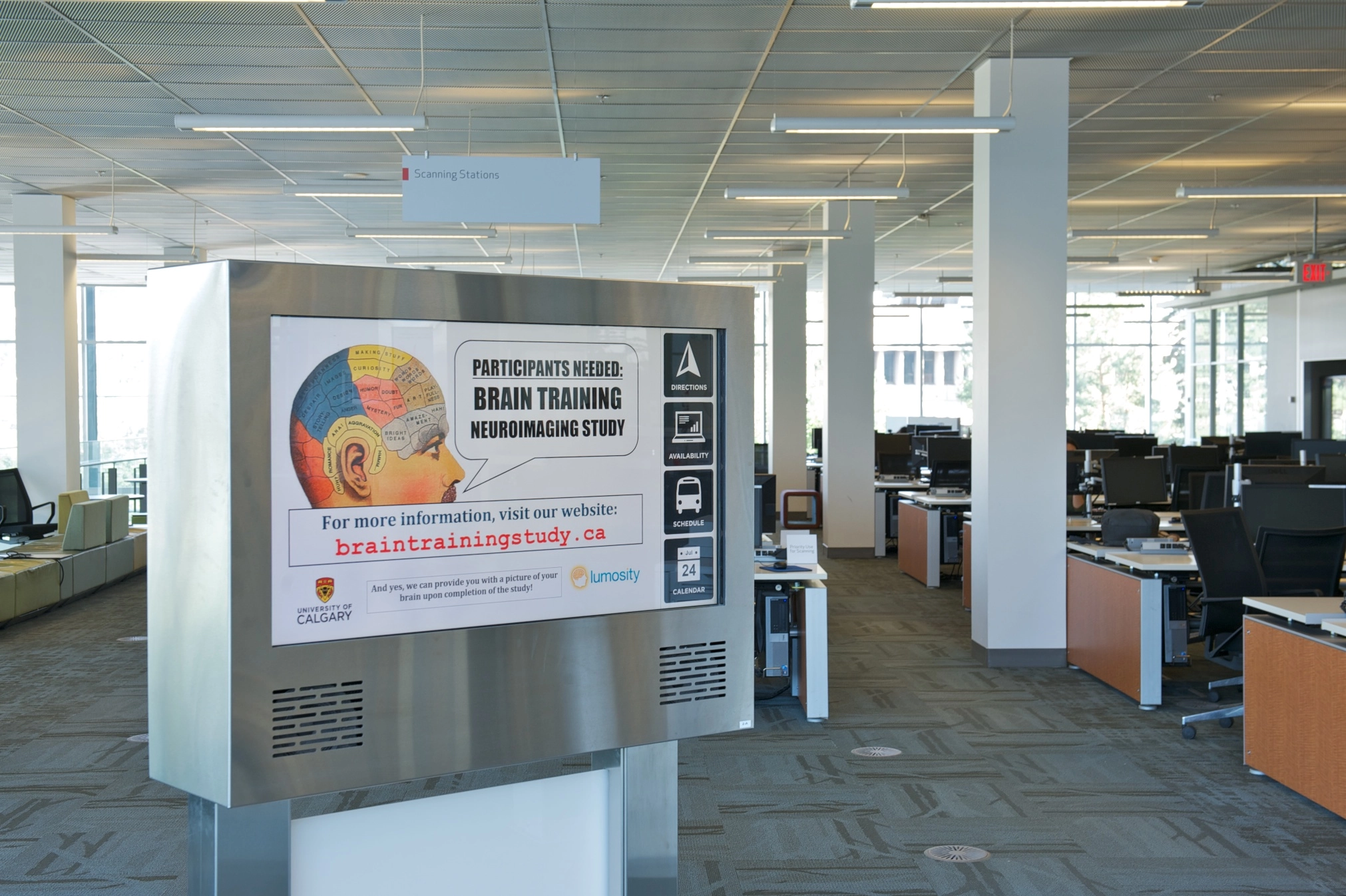
“PCAP (projected capacitive) displays are really becoming cost effective,” Giebel said. “PCAP is the photo-capacitive touch interaction. It’s something you’re used to on your tablets and your phones. We’re starting to mirror that on the large-format displays. If I were looking at interactivity and touchscreens, PCAP is definitely where I would be focused.
“The experience is more responsive compared to some of the earlier touchscreen technology. It’s just a better user experience. It was really expensive three years ago, and now, it’s pretty cost effective. PCAP versus IR displays is really competitive and worth the investment.”
3. INTERACTIVITY
Aren’t touch and interactivity one and the same?

“We’re starting to look at how can we create interactivity outside of a touch,” Giebel said. “How can we get data integration to be relevant so that the content on the screen is what the user expects at the right time, and enables them to make a decision or take action faster than they normally would if they had to go into a system and pull reports and do analysis? At the end of the day, we’re creating an experience.
“My team and I focus on a lot of corporate applications. How can you better inform employees? How can you allow them to take action and really enable them? You can build a dashboard, or pull reports out of different BI (building intelligence) systems, but you really need an analytical mind to understand what you’re looking at. When we visualize that data and boil it down to something simple, that creates action.
“Also, don’t forget the push model and the non-interactive screen. What can you present and put in front of people that enables them to do their jobs better without having to touch the screen?
“There’s absolutely a place for interactivity, but sometimes the message gets lost, and we tend to play with the touchscreen more than understand what the data’s telling us.”
4. VISUAL DATA
“Digital signage is important because making information visual makes it easy [to understand],” Giebel continued. “It’s engaging, and it allows people to understand what’s going on. In four seconds of looking at a screen, you can get an impression of what you should be interested in and what needs to be managed. That’s how we should look at that data.
“We often interact with our clients to say, ‘What would be effective for you? What story do you really want to tell with this data?’ It can be a challenge to understand that.
“A lot of people get hung up on not trusting their data. They say, ‘I’m going through a big data project right now. I need to wait until it’s perfect.’ Visualizing that data is the best way to manage the changes that are coming, to put new processes in place, and get your data clean.”
Have bad data? Visualize it, Giebel advised.

“Use the signs to push your message and actually manage your teams to say, ‘This is why this data is important. Look at what we can do here. We have inaccuracies. We need to fix that.”
Want to work on your employee engagement?
“You need to communicate to your employees and make sure that they don’t feel like you’re hiding things from them. Believe in a culture of transparency,” Giebel said. “You can’t hide anything. Just put it out there. If it’s a problem, let’s fix it. If it’s great, let’s celebrate it. The screens really allow you to do that. “
5. MOBILE
Bringing mobile into the management side of content and the user experience is occurring,” Giebel said. “We’re doing everything on our phones, on our tablets. That device portability and being able to use content on any device is a trend we’re seeing and really working on.
“We’re hiring more and more Millennials into the workforce. Watch them: They grew up on devices. They’re fixated on them. Sometimes people get frustrated by that; you should take advantage of it. They’re paying attention to something. Put yourself and your information on the devices that they choose to give their time to, and you’ll reach them in a far more effective manner. Not only screens on walls—screens in pockets, screens in briefcases. Make sure that information’s wherever the user chooses to get their information, and that will give you the best results. That’s where you really need a cross-platform capability.
“The workforce is becoming more remote. We’ve got a lot of employees that don’t sit in an office. They’re on the move. They’re changing offices. While some people might prefer a screen, they may not have that option available to them. I’d hate to miss out on the chance to provide information or help one of my employees while they’re traveling just because I can’t put a screen in front of them.”
Info
Fourwinds
interactive.com

